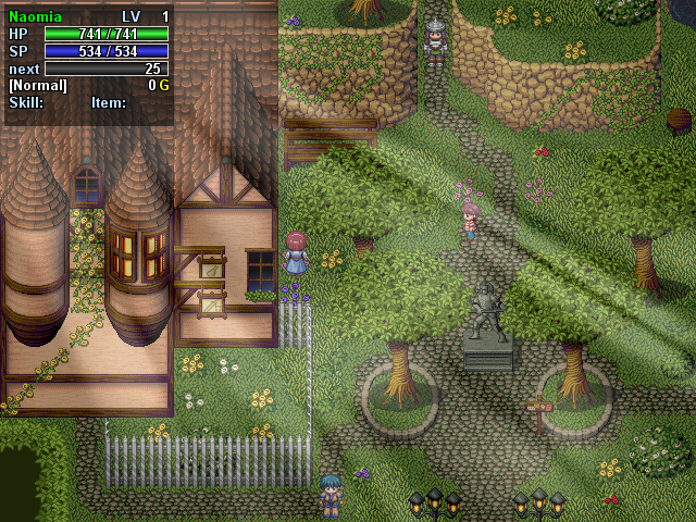
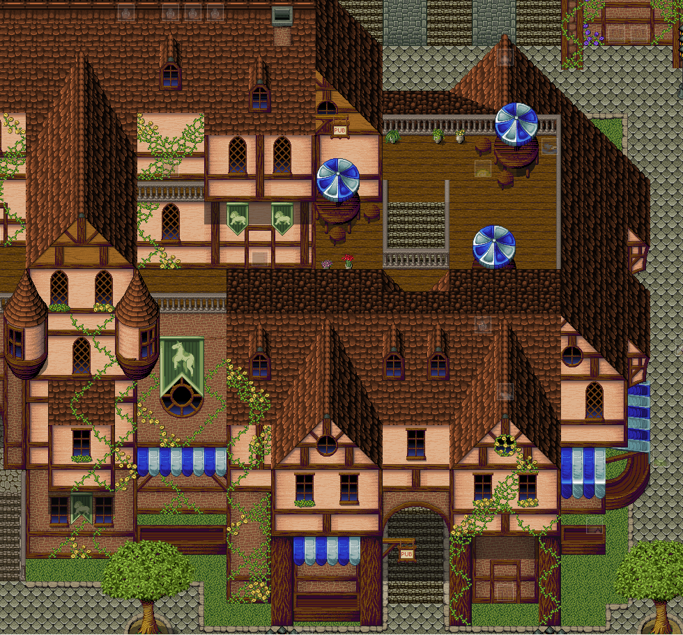
Just testing Inquisitors new tileset. As you can see, Im not used to map with this type of tileset. I rather like to map with the RTP.
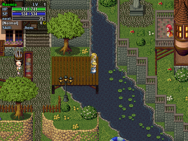
we can see you are not helping the O-zone layer, You leave lights on during the day! 
poor o-zone


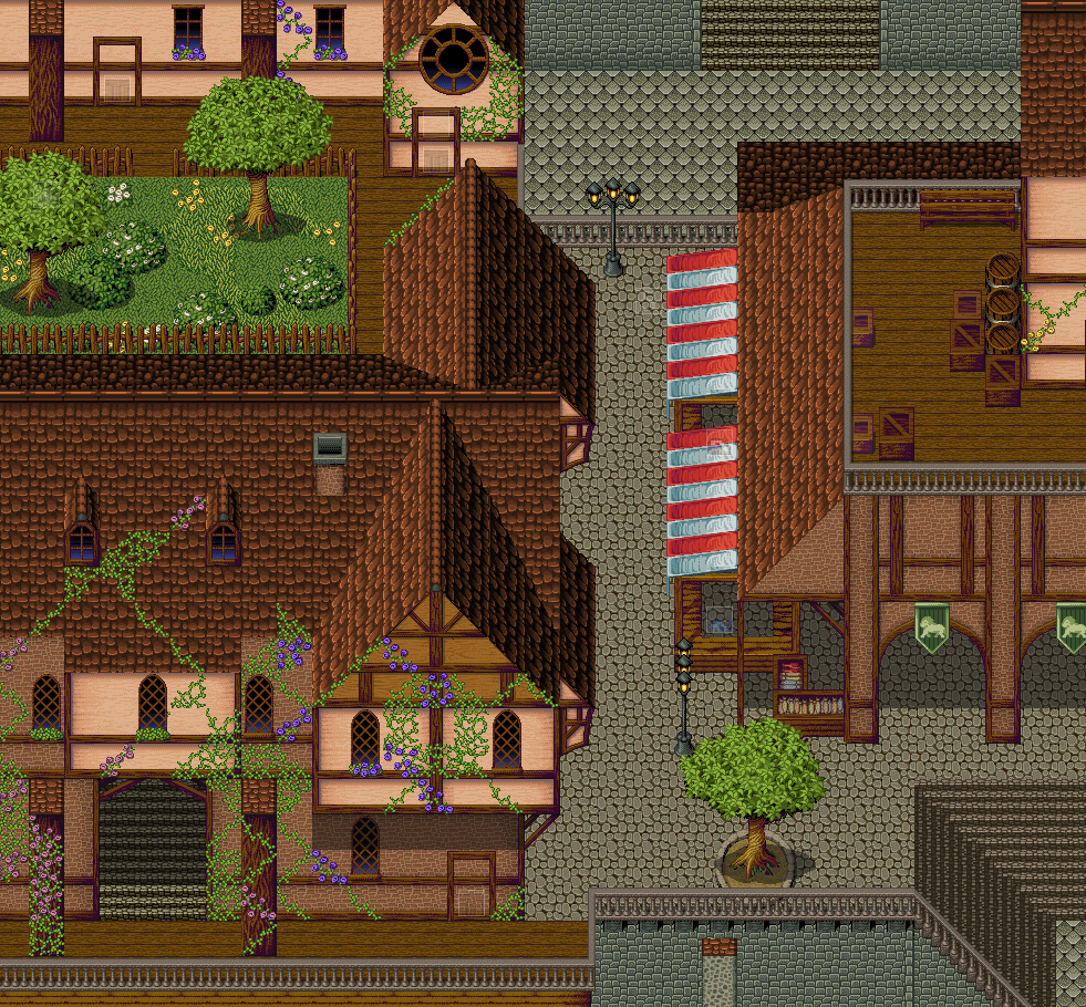
Just testing Inquisitors new tileset. As you can see, Im not used to map with this type of tileset. I rather like to map with the RTP.
we can see you are not helping the O-zone layer, You leave lights on during the day!
poor o-zone


[spoiler]
Can't wait for Aora?
Can't w

Sorry for boxes lads  I uploaded the screen just before seeing the post
RTP ;(
@ Horusae & chaosmakr: They are all good maps. Chaosmakr, they really are nice tilesets, and as far as I'm concerned your mapping with them is quite nice.


The man, chaosmakr was QUOTING someone else's maps there. And anyway, they are Inquisitor's tilesets, not his.
Nice Townmap..., but with Inquestors Tileset it looks better x)
 <- LVL GRaphic of the Firerballskill
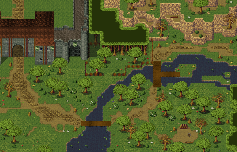
Rosenpalisade:
Rosepalisade (?)
Complete

Upper

Middle

Down

~Ragnai

I like your maps ragnai. they aren't overly complex or cluttered like some that I see. Keep it up mang.

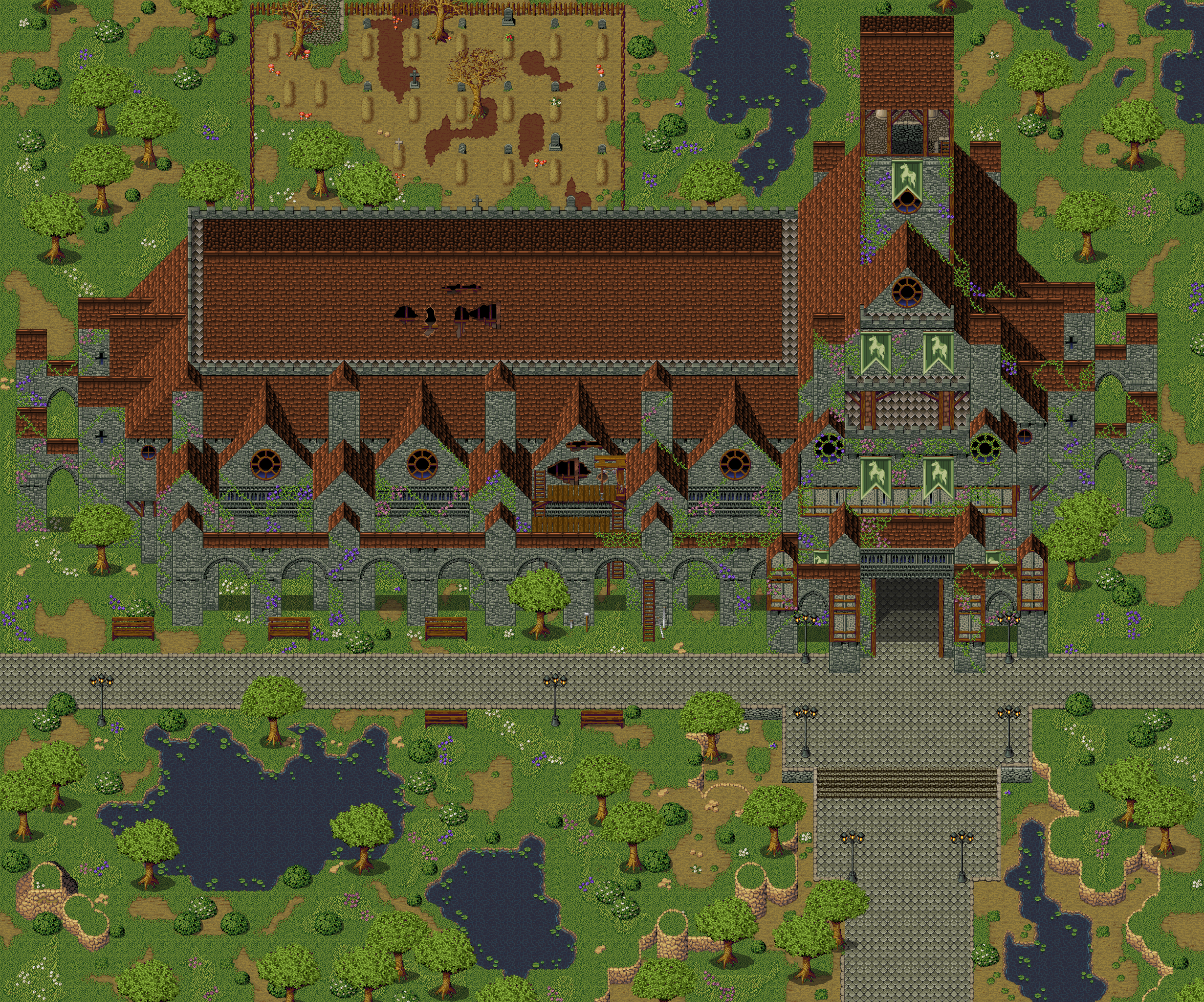
I was fiddling around with Inq's tileset and I decided I would try to build a little watchtower type of thing.

I would need to edit a few things, like take out the shadows at the bottom of the posts and put proper edges on the support beams underneath the platform and around the hole for the ladder, but I think it can out nicely.
One thing I noticed about Inq's tileset: it seems harder than normal to fill up natural spaces. A lot of the time it comes out as either really crowded and too busy or too sparse and open. I'll experiment with it and find a middle ground and see if you guys like it.
Asides from the hole and the massive square leg-things it's really nice. I love Inq's set but I just find it too overwhelming to use, and I'm the sort of person that will give up using it after five minutes if I can't get used to it straight away.
I was fiddling around with Inq's tileset and I decided I would try to build a little watchtower type of thing.
I would need to edit a few things, like take out the shadows at the bottom of the posts and put proper edges on the support beams underneath the platform and around the hole for the ladder, but I think it can out nicely.
One thing I noticed about Inq's tileset: it seems harder than normal to fill up natural spaces. A lot of the time it comes out as either really crowded and too busy or too sparse and open. I'll experiment with it and find a middle ground and see if you guys like it.
Looks good. Only thing is that it looks like the top of the ladder needs to be moved up one square, or down I mean.

@Been:
Thanks to you, I want to make maps where the Player can go trought, and have the feeling of a free world, not like Guild Wars where you have a beautifool world, but with narrows 
@Bluebarry:
Nice map, but in the right and lowerright, plz make some cliffs.
PS: Nice Screentne+FOG
~Ragnai
I gots a screenie map to show you all
But firstly, this is my first time use of inqs tile set so bear with me also my first map in like 6 months.
I need critique !

Just something for a mapping contest at ASP(Angel Spire Productions) And it's the 1st time Ive used Mac & Blue in a LONG time.

A large city map I'm working on for a team project. The others don't know about it yet!
M-M-Maxy! That's awesome. That's all i can say!
Yeah, that's a ridiculously good sense of scale created there.
Here's another one. It's a biggie.
Please Maxy, stop it! They're just too awesome!
There is something about the roof that annoys me a lot Maxy. Perhaps its the fact that in some places the two roof parts do not connect and seem forced. I don't have the tile right here so it could probably be a limitation of it.
But overall I love it ;P, specially the "outside"
Here is my main town called "Micserian." It is still a WiP. Tell me what you think. 

Well the only thing to comment on at the mo is the buildings. They're a good start. At least they're unique and interesting. Have some overlapping on the cliffs.


@Maxy, wowzors. You know it's great, you spent a lot of time on it. I'll just mention, in the second shot, there's a roof on the right side that doesn't seem to be transitioning from left-side to top-side. Shouldn't it be a down-right to up-left transition line, rather than the other way around?
EDIT: I looked at the cathedral, and coming from the assumption that it's our Beaumonde I'm going to say I was thinking of it more as a bustling city cathdral, in the middle of urban congestion, with narrow streets and other nearby buildings, except for a reasonable plaza in the front. What I see is a gigantic building misplaced in the middle of the countryside. But it sure is a beautiful building, well designed. I just don't think it's got the right surroundings.
@kenpokis: Is that building in the northwest supposed to be really, really tall? Because that's what those roofs convey when you just keep them going like that. Given the perspective, if they were that tall, there should be a substantial amount of reversed roof going back down above those tiles, but the tiles aren't there. And about the cliffs, they don't have to all be three tiles high. Vary them more, break them into two or three cliffs terraced within each other, and vastly expand the transition line. There should be anywhere from three to fifteen tiles separating the bottom of the cliff to the top, with the intermediate cliffs and terraces, and the terraces should expand and contract to make it interesting, with a much wilder cliffline that fluxes up and down several more tiles than you've done.
Just something for a Map Design Contest at GW.

Yea I changed my little town into the big city in my game so there aren't going to be any cliffs. As for the building it was suppose to be long and only two stories. Oh yea Tau that's nice.
Here Are My Finished Game Named "Dragon Ball Z : Reification"
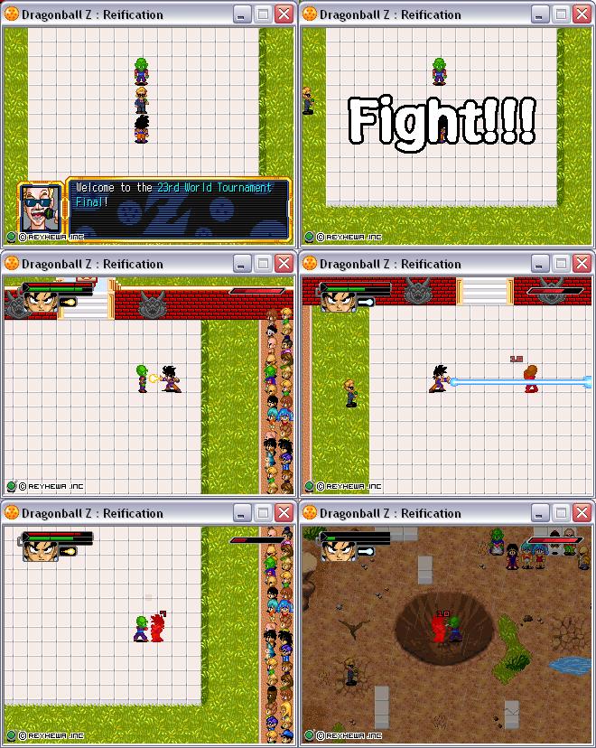
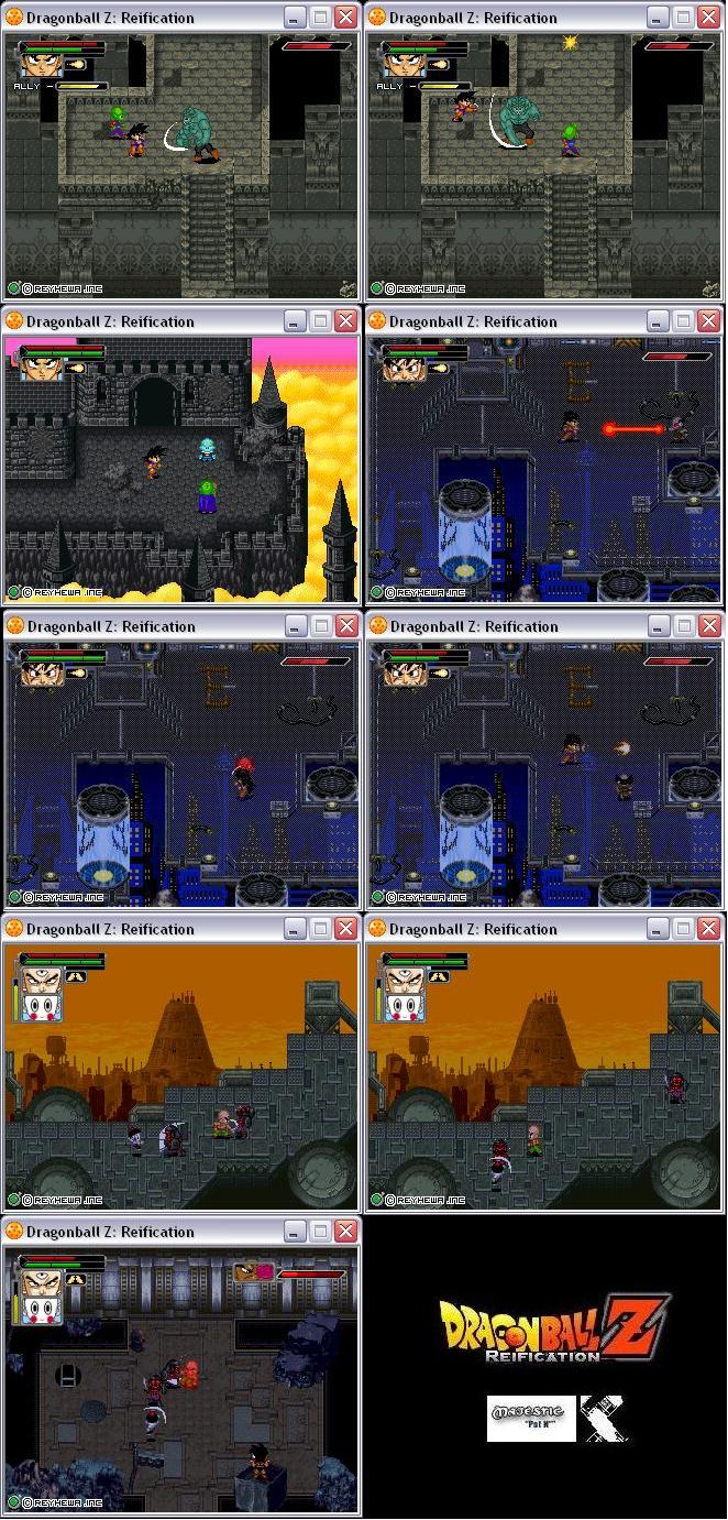
Other Games Coming Soon . . .
That looks pretty good. I might want to play that...
I have creat a demo but the download link dont work.
The games BIG Goku has posted about are all stolen, he didn't make any of them, plus one of the is even a virus, ban him, he did this at Gaming World.
Anyways, I may as well post something while I'm in here. Something I did for the GW Map Design(I won too )..


The games BIG Goku has posted about are all stolen, he didn't make any of them, plus one of the is even a virus, ban him, he did this at Gaming World.
That would explain the inconsistencies between the perfect grammar in the screenshots and the 100% unintelligible posts that this fellow makes.
It would also explain "Other Games Coming Soon," as if they were to be put out at the speed of light. Thanks for informing us!
To move back to screenshots, I must say being a part-time SNESophile I'm still drawn to that 16 bit look, and you manage to pull that off and then some. Wonderful!
Thank you, did you notice the subtle overlay that's in their, no one has mentioned anything so far haha. :cool:
Yeah, what is that, a glow from the orb in the northwest or something? Thanks for the tip about BIG Goku. I'll make sure that any more of his posts are thusly scrutinized.
@Tau: Wow, nice one. There are only 2 things I don't really like.
1. The sky color doesn't really fit to the chipset style.
2. If this guy was really leaning on the tree, part of it's leaves would
kinda cover him.


Don't really look at the border graphics, they aren't final cos I'm
currently doing the technical stuff. 
I love the idea of having the border there! That takes me back to playing Link's Awakening on the Super Game Boy  .
.
I love the idea of having the border there! That takes me back to playing Link's Awakening on the Super Game Boy .
Actually the border is gonna be a point n click menu. For sure, the main menu is almost finished.
edit: 'nother screen, freshly-made this time. Item menu in action.
is the game going to be in english? or at least have a translation?
Why does is use rips from the GB Zelda's? Wouldn't LttP be higher quality?
screen size is reduced because ofthe borders. Gameboy zeldas are more effective for such a small window, tbh.
is the game going to be in english? or at least have a translation?
The first version will be German, but I will also make an English version.
Why does is use rips from the GB Zelda's? Wouldn't LttP be higher quality?
Firstly, there are so many people using LttP rips. I decided to make something
different.
Secondly, I ripped these ressources when I was 14. I also did a lot of mapping
that time, so I know how to handle this style.
Last but not least: This is the only style I can make custom chips and edits
which look good.
Ah Fuck You Tau.
Ah Fuck You Tau.
Don't Flame or swear Please. We have younger members, as well as its against the rules of this board last I checked. If you want to say something like that, pm it at the least. We'd prefer if you didn't say it at all though.
You can't have everything....where would you put it?
OH MY GOD! THERE'S A BEAR IN MY OATMEAL!

I appreciate your enthusiasm for the rules, Haif, but let's not go nuts.
Ah Fuck You Tau.
Don't Flame or swear Please. We have younger members, as well as its against the rules of this board last I checked. If you want to say something like that, pm it at the least. We'd prefer if you didn't say it at all though.
Your policing of the internet is unwarranted because A) I wouldn't consider that a flame in the least, especially with the after it, B) Since you have to be 13 to register here, I'm sure most of our members aren't even phased by the occaisional swear (it's the internet after all), and C) he's hardly in violation of the rules
Well I'm sorry guys its just around my area it taken a bit more.......overly dramatic? Sorry.
You can't have everything....where would you put it?
OH MY GOD! THERE'S A BEAR IN MY OATMEAL!
There was the offensive bit in there, I'd feel offended if some faceless cyber bullied me.
Anyway back to the screen shots.
Heres a screenie of my latest game 'freyulian jiunet saga 4: kingdom of hureta' its gonna have super cool monsters and stuff.
Anyway here it is.

Any comments, Its nearly done.
Well it's a little bland, but it's got plenty of potential I think! At least your mapping is consistent.
Psygon was (and still is - don't you forget it, [nooffenseintended, please don't appeal for my banning, HR]motherfucker[/nooffenseintended, please don't appeal for my banning, HR]) the king of piss-take amateur game-making. I'm sorry, but you have a snowball's chance in hell of taking his crown.
Bugger, you can't type in small-print on here, t'would seem. Well, read the below at your own peril.
<!--fonto:Arial--><span style="font-family:Arial"><!--/fonto-->DISCLAIMER: If the above project is genuine, then OddButInteresting is not liable to apologise for any offense taken from his comments. That includes the use of the following profanities: Cunt, Cock, Arse Shit, Fuck, and Wank. OddButInteresting also holds the individual responsible for continuing to read just to satisfy their curiosity. Don't wanna get burnt, kiddos? Then don't play with fucking matches!<!--fontc--></span><!--/fontc-->
Your not gonna let me live this one down are you? Look if you remember to when I JOINED here I (The account that I originally created and was banned for) used to be the one who was yelled at for swearing and flaming ok? I just didn't think it was really that necessary of a post either. It was a short sentence just to tell someone off. Which could have been done in a pm and in no way contributed to the thread ok? If any of you knew me in person, I'm in no way one to be "policing" the place.
You can't have everything....where would you put it?
OH MY GOD! THERE'S A BEAR IN MY OATMEAL!
Chill, mon! I'm just faffing around with you :lol3: .
It was merely a harmless momentary joke; nothing personal.
We yelled at you for terrible posts, not swearing.
Can I yell at you for excessive use of colour?
EDIT: Also <!--fonto:Comic Sans Ms--><span style="font-family:Comic Sans Ms"><!--/fonto-->way<!--fontc--></span><!--/fontc--> too much formatting.


Well the idea was that it was to based on pangea. So I figured if there were islands but there was still basically one large landmass (as i said the middle has got to go) then there would not be very much drift. I suppose tiny islands that had broken away much earlier could be dispersed around the map... but as chunks broke away they would trail pieces with them.
Now I'm fine with redoing it, but i think I need a game plan before I go ahead and draw it... and a map size to start and end with... this one started as a 50 x50 map and kept having pieces added on as it grew.... i think i should start with the entire space.
[[[EDIT]]]
So really rough... just for the spacial and shape properties: