POST INDIVIDUAL SCREENSHOTS HERE!
This is for small numbers of screenshots from your projects or ones you've just knocked up for fun. This is where you'll get feedback for the visual aspects of your game only - you do not need to support these with plot or gameplay dynamics. If you wish to mention these things it's probably worth starting a new topic.
After resisting temptation for so long, I've had to crumble. I'm going to have to adopt a practise from another website (you know the one) and have a screenshot thread. It pains me to do so because I usually aim to keep RPG Palace/Town unique. However, screenshot threads generate tremendous interest and so I'm adding one here.
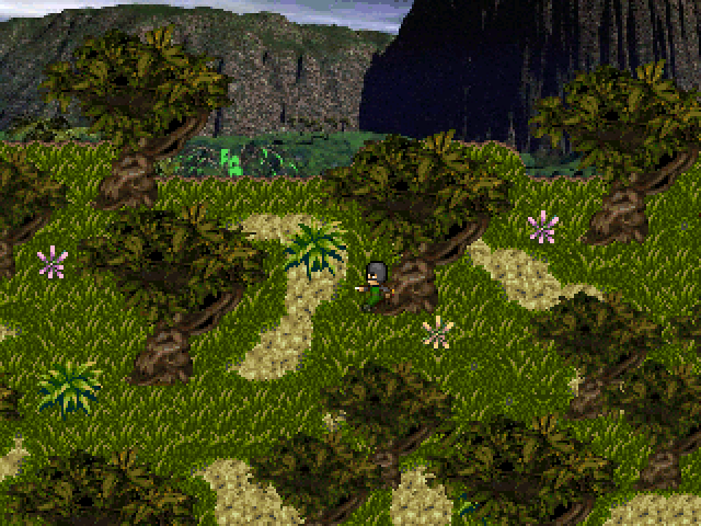
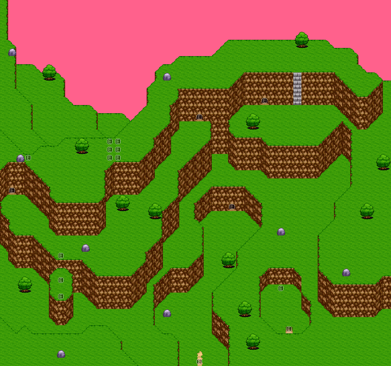
This should not interfere with the TsukuruCON, though. Bare that in mind. I'll start with a map from a project I'm currently making.
It's the dungeon crawler I've mentioned. There will be a playable version for the TsukuruCON - this is just to whet your appetite.
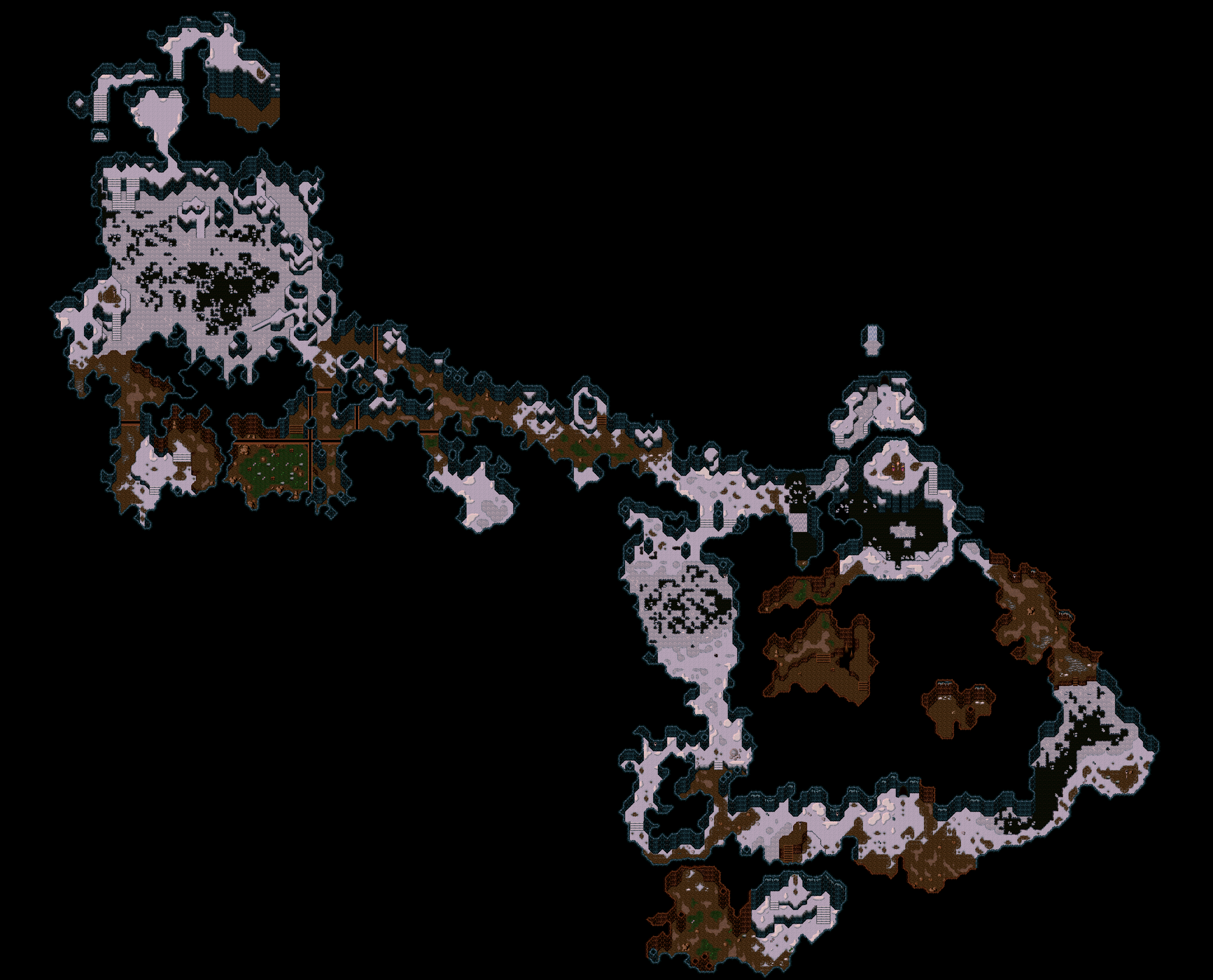
Here is the full map.


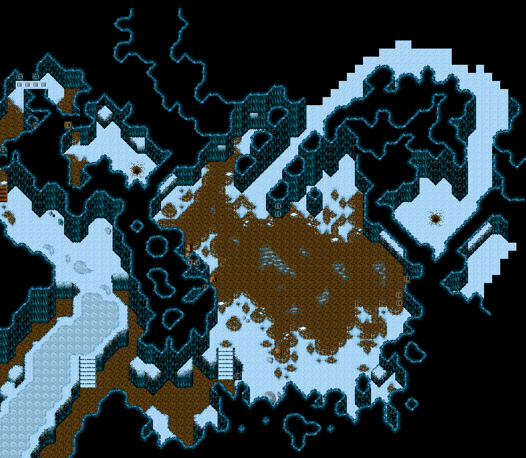
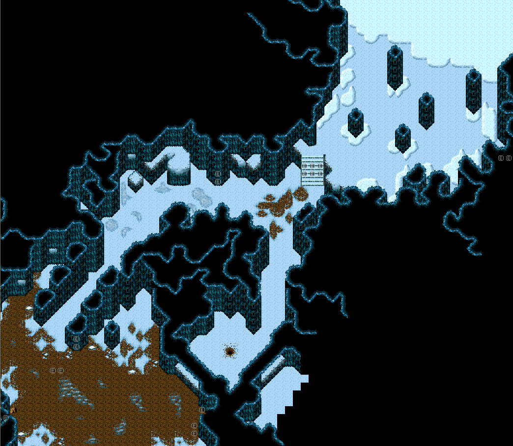
 .
. 


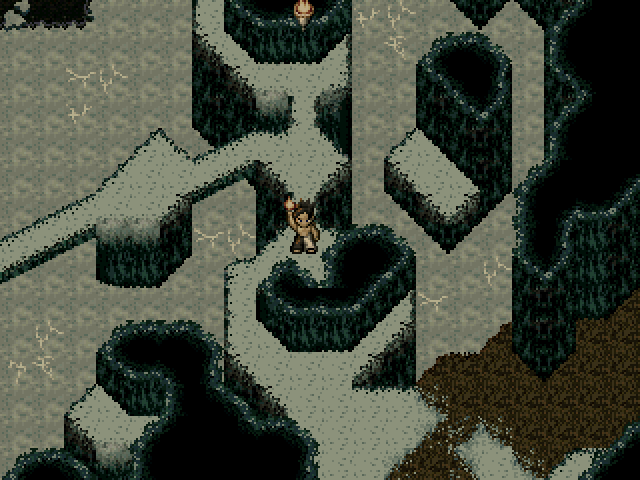
 They're magnificent, Christophomicus! Excellent us of the chipsets and a superb technique. It's good to see there are people who take the time and effort to make their maps look stunning.
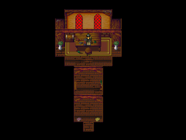

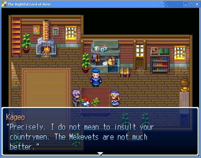
 This is not the first time he has lied, though.
  Sorry, didn't mean to, like, offend you or anything, but yeah. ._.
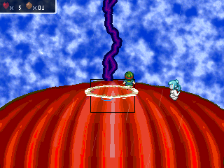
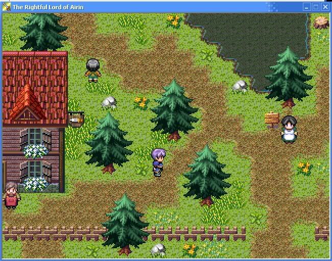
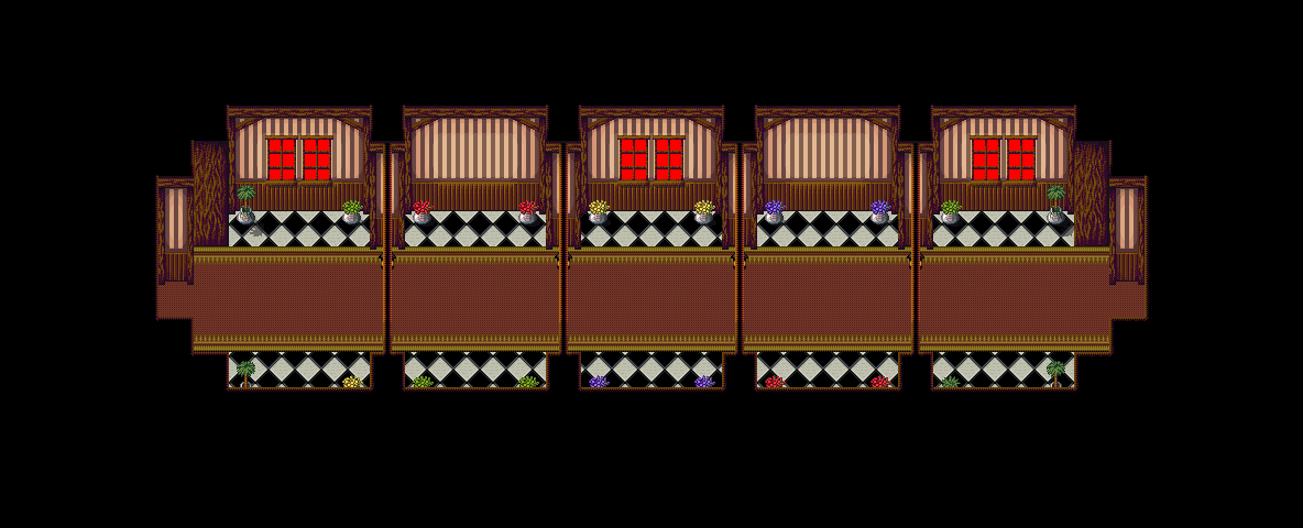
From a game I barely even started.
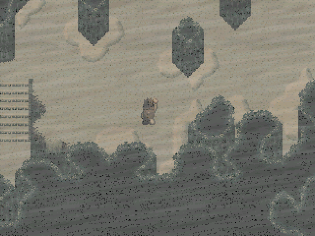
Anyone remember where this is from?